In China, the concept of color is a little different, particularly when dealing with household items. I spent half an hour arguing with the men who delivered carpet to our first apartment because we had ordered tan and what they brought was gray. They insisted it was the same color. Later, we ordered dark forest green couches and they came a lovely bright grass green. Again, we were told essentially, "same same." The worst was when I chose chocolate brown curtains and what arrived at my house was, well, what would you call the color of what comes out of a baby the first few weeks? Yeah, that. And I was told, "sometimes the color is a little bit different."
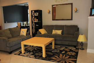
So I shouldn't have been surprised when I asked for a coffee table to be made to match this lovely antique piece:
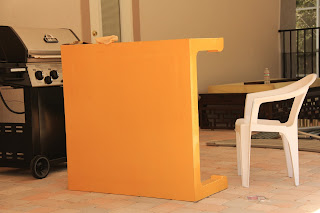
And what I got was this traffic sign yellow table:
But honestly, this seemed like a fun challenge to me and truth be told I'm kind of bored these days so I went to work sanding off the brightness. I did it once already, but it was still pretty bright, so here's attempt #2:
You can see that on the legs they did make the effort to antique it up a little, and I was able to keep the look of it there. The top I've just managed to tone down.
I'm not sure if I'm quite done (well, I haven't sealed it so I know I'm not) or if I might try to even out the color on top, but at least it isn't stopping traffic anymore. Now useless note to self: be more specific when describing colors to Chinese workers.


A while ago I looked at Annie Sloan's paint - for when I have the time and money to frequent little vintage stores and paint furniture - and they have a dark wax that goes on top of paint. I have really NO IDEA what I am talking about but it seems like that sort of technique could work well ... add some dark color and vintage-ness and also seal it up.
ReplyDeletelove the gray/yellow colors. that's a great lampshade.
ReplyDeletesaw eric today. seems so 'normal' for him to be here.
and my word for 2013. i got it today. NEEDY. As in "I am needy". It's a risky one, but i think i'm up for it :)
Thanks Laura! The lampshade is IKEA. :) I'm so bummed that Erik gets to be in Thailand and I don't!
ReplyDeleteNeedy sounds like a good word. Let me know how it's going for you!
Rachel - thanks for the tip! I looked into a little bit. Seems like if I want to use it, I need to do a better job sanding it, or you'll see all the lines. If nothing else, it made me do a better job on it! :)
ReplyDelete